Signed in as:
filler@godaddy.com
BEGINNING, PROCESS AND TRANSFORMATION
The Centralized Image series were originally conceived and produced many decades ago. They have multiple dates—from 1966 to their date of completion and signing. The medium of preference is silkscreen also known as serigraphy.
The idea for these prints comes from my interest in the ubiquity of letter forms and the power of centralization as a formidable structure symbolizing beauty and unity. Many editions of sixty were produced and a few artist proofs. Black and white are the are high contrast of colors for this series; the same letter forms that appear nnewspapers, magazines, and books.
Many prints were sold, Many remained, and those were put away. Many were printed on white paper with black ink. A few were printed on black paper with white ink.
Soon after, a change took place from black and white prints to extend their life as an explorative undertaking, using spectral colors and the same imaged-screens used for black and white prints. These image-screens utilized multiple times in different combination, and colors that were untested for the interactional effects. Unlike the black and white prints, the only prerequisit here was to have every-imaged-screen centered on the previous one without having any predetermined organization in mind. However, there was the hope, although slim, that a possibility of chance would intervene banishing the likelihood of chaos happening.
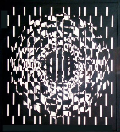
CENTRALIZED COMPOSITE #2 Serigraph, 1966
A few prints came close close to what was envisioned. This spurred me on to overprint for hopeful outcomes. However, what followed only increased the disorganized look so much that continuing on was no longer an option. Disheartened and blinded by these unpredictable failures, and like many of the unsold black and white edition prints, they too fell into a forgotten hole of time. It was time to move on.
Decades passed. Both the edition-black and white and the failed multi-colored prints remained out of sight in boxes, under tables, covered over with papers, and in portfolios. Finally, a dreaded cleanup day arrived. Surveying the messy chaotic studio situation seemed to suggest a similar analogous situation of chaos: that of the disorganized colored prints put away decades ago.
While reorganizing the studio, I came across these forgotten prints and placed them in protective portfolios so I could become reacquainted with them later. I felt responsible for their longstanding neglect, but at the same time, felt good for saving them from possible destruction. Also, it became evident the Composite Series still had a potential for further develop-ment, to a beautiful, organized, restorative success.

CENTRALIZED COMPOSITE # 2 Serigraph, 1966
See B&W above before color was added.
There was so much to be done to reinvigorate this large deserving body of prints. Color again would serve as a means of reaching the place of beauty and unity
I began this long reconstructive process by returning to the remaining black and white centralized, edition-prints. I chose to start with prints that came from the B&W series. Unlike the others, Centralized Composite V was printed on black paper with white ink. Interesting linear elements were added spontaneously as an interest-added feature to transform the images beyond their ordinary look. Ring-like patterns were formed echoing the outer contours of the central form. A force of energy griped the center and outer profiles, expressing peaceful rippling movements, concentrically outward. Other prints would follow, this time using a technical pen and black ink that was a linear enhancement approach, . See print on right as an example.

CENTRALIZED COMPOSITE V 1966, 1984 Serigraph/Pen & Ink, Framed: 24.75" Square
A decade or so later, after the linear enhancements were done, I decided to use color again, and acrylic paint to create a distinctive atmospheric mood of expressive beauty on the black and white composite edition prints. Only the white areas will receive color. My tools are small detail brushes: sizes 1, 2, and 3. Many prints in this series were organized into combinations of colors that worked well together, while maintaining the original black areas of the print. Enough prints were finished in this series to prompt me to return to the last remaining series. Finally— I had to face the greatest challenge of all: the miserably failed multicolored print series. Finding color solutions proved to be more challenging, even daunting then was anticipated. This was mainly due to the interactive complexity of the selected hues against a preexisting chaos of colors. Finding the right mix of colors was an ongoing process. Many prints were processed successfully; still many waited, remaining hopeful for their turn to become a vital spirit again.
See print on right as an example.
SEE SLIDE SHOW BELOW

CENTRALIZED IMAGE 12, 1996, 2010 Serigraph/acrylic